How important is your logo?

What’s in a name… Really? We all know that brands need a name to set themselves apart, but how important is the name for creating a memorable brand that sticks with a customer?
To illustrate this point, ask yourself this: Does this image mean anything to you?

What about this one?
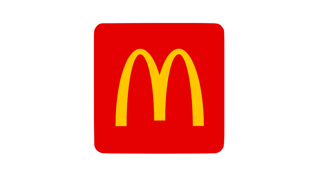
They are just symbols, but unless you live under a rock, you probably immediately knew what they represented. Yes, these brands have names that go with their logos, but once the image itself has become a symbol for that brand, the name isn't even necessary any more. Many big brands don’t even bother putting their names in the advertising they do. The symbol alone is enough, once everyone knows what it stands for. That is why a business needs a strong symbol and theme to represent it. The power of an image should never be underestimated.
A wise man once said, “A picture is worth a thousand words,” and he was absolutely correct. A name only takes you so far if you don’t have a memorable image to replace it. The human mind is much better at remembering images than it is at spelling and names. For example, have you ever not been able to remember someone’s name, but could picture their face perfectly in your mind? The picture comes before the name, almost always. This is what a logo is for a brand. It is the “face” that makes it stick in the brain of the consumer. With a simple and memorable logo, your brand will eventually become highly distinguishable from others.
That being said, not all logos are made the same. If you want a memorable logo, keep in mind this rule of thumb: The simpler, the better. You want something original that doesn’t look like another company’s, but that can be easily digested by viewers. Here are some basic rules that to go by for a simple logo, recommended by our expert designers.
1. Don’t go overboard with color. Sometimes, just one color with white in a logo is all you need. The fewer colors, the less complicated it will be for the customer to commit to memory. It also makes it easier in the future to combine with other colors for branded content. Too many colors can become overwhelming. E.G:
Colorful:

Simplified:

2. Refrain from overusing special effects. This can mean crazy gradients, patterns, etc. Usually, the simpler the logo is, the more professional it looks, and the easier it is to transfer to different forms of media E.G. T-shirts, cards, or websites. A logo with too many different parts can look muddled in print or be too confusing to get your message across clearly.
Before:

After:

3. For the type part of the logo (Called the “wordmark,” choose a simple, clean font. You should use something that expresses the “vibe” of your brand and play around with different fonts. The most important thing to keep in mind is that it is still legible. You do not want people to have to squint to read what the wordmark says.
Before:
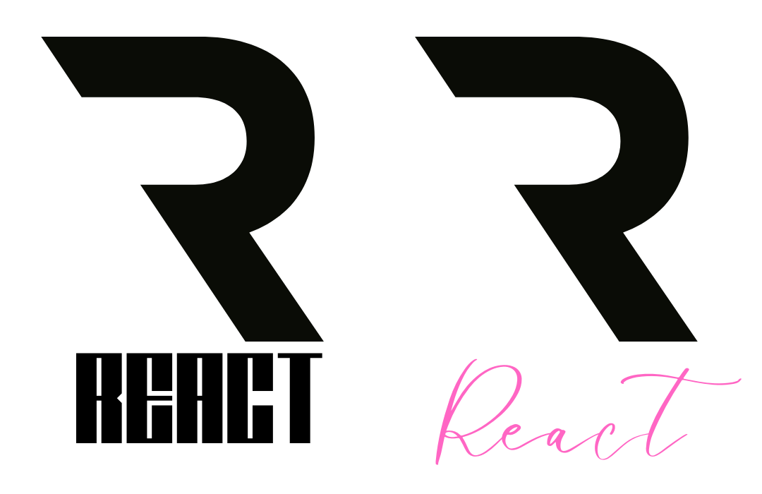
Difficult to read, do not match the dynamic look of the logo.
After:

Much better.
If you’ve read this far and are interested in learning more, read through more of our consultant’s couch series here. If you’re interested in a free consultation, fill out a form on our site here.